Americans' understanding of who counts as "white" has changed dramatically throughout the country's history and even over the last century alone. This map — which covers a decade of immigration to the US, from 1892 to 1903 (via the JF Ptak Science Books blog and Slate) — is a dramatic illustration of what it looked like when "white" wasn't the same thing as European.
This insanely detailed map proves race is a social construct
Mouse over any part of the map to magnify it:
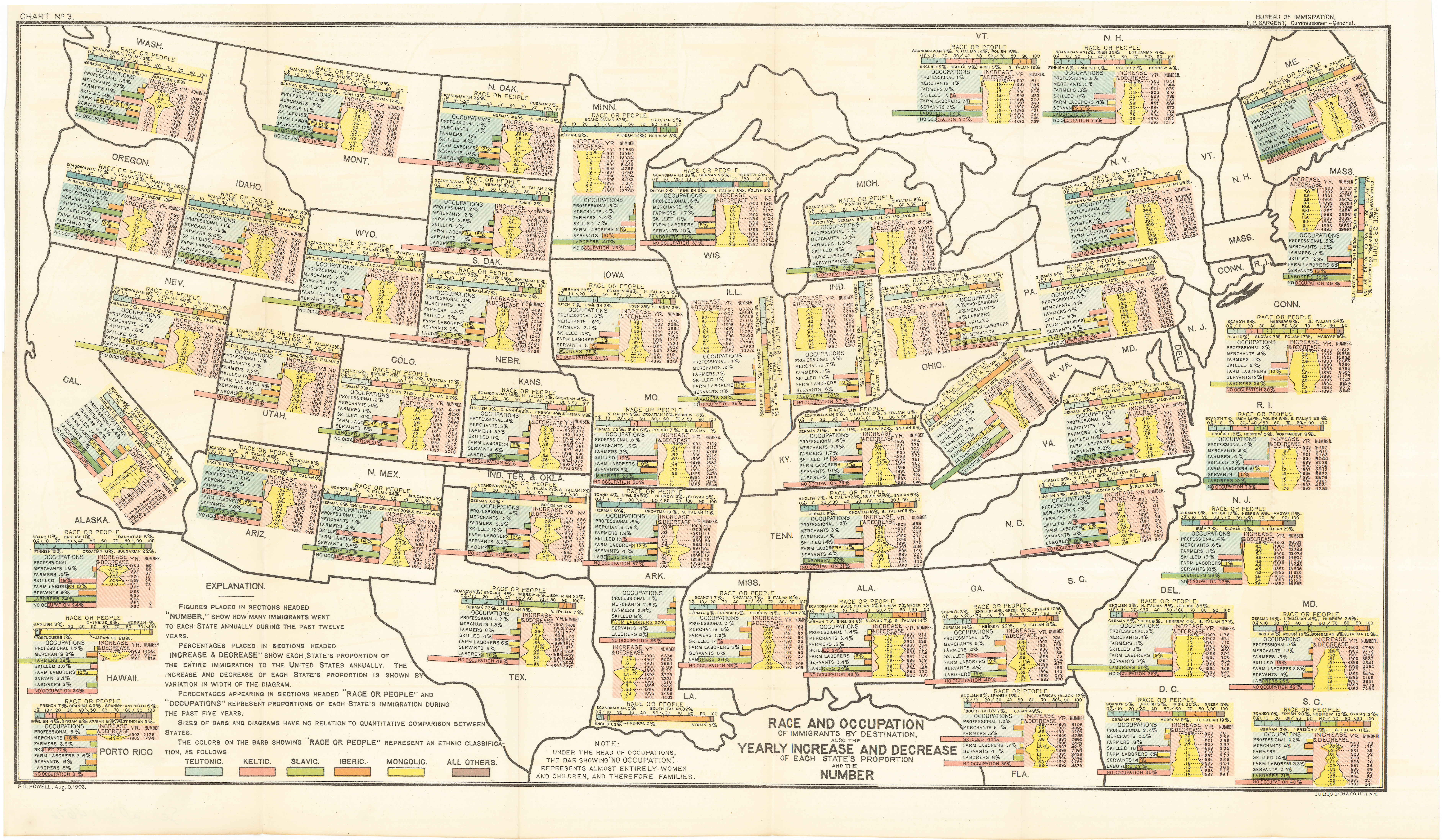
Here’s how to read the map: each state (plus DC and Puerto Rico) gets an infographic describing its immigrant population. The right column of the infographic covers how many immigrants settled in the state each year, and how many of the country’s immigrants that represented. The left column covers the occupations those settlers held. And the top bar depicts the ethnic mix of each state’s new immigrant population, color-coded by race — with notes about the nationalities with the biggest populations.
But the breakdown of race doesn't look terribly familiar to those of us who don't live in the early 20th century: Teutonic, Keltic, Slavic, Iberic, Mongolic, and "all others." In other words, it's distinguishing among white, European immigrants — not-so-subtly implying that the more-established Western and Northern European immigrant groups (including Scandinavians, Irish, and Germans) were more firmly white than the "Slavic" and "Iberic" immigrants from Eastern and Southern Europe.
For easier reference, here’s a table pulling together all the immigrant nationalities mentioned on the map, sorted by their assigned “races”:

The hierarchy of the table reflects the conventional wisdom of the time — eugenics and social Darwinism hypothesized that the Nordic races were the most evolved, that southern and eastern Europeans were less so, and that non-Europeans (who are barely worth a mention on the immigration map) were the “lowest,” least-evolved peoples.
There wasn’t universal agreement on what the races actually were, but the federal government appears to have used “Nordic, Celtic, Slavic and Iberic” regularly to categorize the immigrants coming into America. A medical journal article published about a decade after this map expresses concern about the “preponderance of the Iberic and Slavic races” among recent immigrants, because of “their poorer physical and mental equipment, and their radically different ideals and standards of living as compared with the Celtic and Teutonic races.”
By the point that article was written, the government was beginning to respond to fears like the ones the authors expressed — by moving toward widespread restrictions on immigration. (Asian immigrants had been excluded since the 19th century, but the US government didn't put global immigration restrictions in place until the early 1920s.) Under the strict quota system set by the Immigration Act of 1924, only 164,667 immigrants would be allowed to come into the US per year — fewer than settled in the state of Pennsylvania alone in the year 1903.
And it was much easier for an immigrant who came to the US in 1903 or so to become a citizen than it is for an immigrant who comes today. The immigrants represented on this map could apply for citizenship five years after arriving in the US, without having to go through intermediate steps like a green card, as most immigrants have to today. And they didn’t even have to learn English to become US citizens.
To learn more about how Americans' understanding of race has changed over time, check out my Vox colleague Jenee Desmond-Harris' article 11 ways race isn't real.
See More:


